Guidelines
Mark Allison
 v2.4 alpha 7
All of the examples in this article have been created using Android Studio v2.4 alpha 7.
v2.4 alpha 7
All of the examples in this article have been created using Android Studio v2.4 alpha 7.
You may see differences if you are using a different version.
 v1.1+
All of the examples in this article have been created using ConstraintLayout v1.1+.
v1.1+
All of the examples in this article have been created using ConstraintLayout v1.1+.
You may see differences if you are using a different version.
What are guidelines?
Those who are familiar with graphic design tools will be familiar with the concept of guidelines already because they are commonly used. But for those that are not, a guideline is a visual guide which will not be seen at runtime that is used align other views to. This is a bit of an abstract concept, but they are really quite useful once you understand how they work. Material Design recommends the use of keylines and we’ll see how we can easily define these using guidelines.
Guidelines can be oriented either horizontally or vertically. We’ll focus on vertical guidelines in this article, but the same concepts translate in a fairly obvious way for horizontal guidelines.
Creating a Guideline
To create a vertical guideline you do so by right clicking on the blueprint view and selecting Add Vertical Guideline from the context menu:

In old versions of Android Studio you would not see the newly created guideline until you clicked on the blueprint view. If you are using an old version of Android Studio and don’t see the guideline you just created, just click anywhere inside blueprint view and it’ll appear.
Types of Guideline
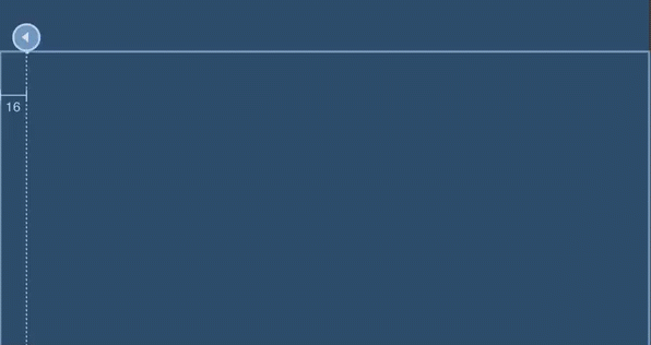
There are three distinct types of guideline. By default a guideline will have a fixed offset from the start edge of the parent ConstraintLayout (specified in dp). The guideline that we just created is offset from the start edge by 16dp. I’m referring to start rather than left because it’s good practise to keep our layout friendly towards right-to-left languages.
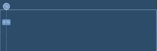
The second type of guideline is offset from the end edge; and the final type of guideline is positioned at a fraction of the width of the parent ConstraintLayout. There is an indicator at the edge of the guideline which shows the type, and we can cycle between the types by repeatedly clicking on this:
The left and right offset types are useful if we want to set up keylines, whereas the fractional type provides some of the functionality provided by PercentLayout.
Adjusting Guidelines
Once we have a guideline set up we can adjust its position by simply dragging the line (as opposed to the type indicator):
It is worth noting that the Guideline will snap to certain positions - at either of the default keylines (offset 8dp from either edge), and at 50% of the parent width. You can see that happening in the example.
Using guidelines
Now that we know how to create the different types of guideline, and adjust their positions, what can we actually do with them? We can use them as any other view as a constraint target - in other words we can create a constraint from an anchor point of any view in the layout and align it to the guideline. If we then move the guideline, the view will move with it:

This is actually pretty powerful. The example only shows a single view constrained to the guideline, but if we were to have more views constrained to it, moving the guideline would cause all of them to move.
Guideline internals
For those of an inquisitive nature, let’s take a look at how guidelines are actually implemented. The Guideline class is actually a subclass of View. It will never draw anything (because it has a final onDraw() which is empty) and has a fixed visibility of View.GONE. Nothing will ever display at runtime, but during the layout phase it will have a position to which we can align its siblings. So a Guideline is actually an extremely lightweight component which has no visibility to the user, but which we can use as a positional reference in our layout.
Guideline XML
So let’s take a look at the XML for a guideline and a view constrained to it:
<?xml version="1.0" encoding="utf-8"?>
<androidx.constraintlayout.widget.ConstraintLayout
    xmlns:android="http://schemas.android.com/apk/res/android"
    xmlns:app="http://schemas.android.com/apk/res-auto"
    xmlns:tools="http://schemas.android.com/tools"
    android:layout_width="match_parent"
    android:layout_height="match_parent">

    <androidx.constraintlayout.widget.Guideline
        android:id="@+id/guideline"
        android:layout_width="wrap_content"
        android:layout_height="wrap_content"
        android:orientation="vertical"
        app:layout_constraintGuide_begin="16dp" />

    <TextView
        android:id="@+id/textView"
        android:layout_width="wrap_content"
        android:layout_height="wrap_content"
        android:layout_marginTop="16dp"
        app:layout_constraintStart_toStartOf="@+id/guideline"
        app:layout_constraintTop_toTopOf="parent"
        tools:text="TextView" />

</androidx.constraintlayout.widget.ConstraintLayout>
The guideline itself has an app:orientation="vertical" attribute, which obviously declares a vertical guideline (we could also specify a value of horizontal here). It also has app:layout_constraintGuide_begin="16dp" which positions the guideline 16dp from the start edge of the parent ConstraintLayout - once again, I’ll use ‘start’ rather than ‘left’. To position the guideline relative to the end (or right) edge we would use app:layout_constraintGuide_end="..." instead; and for a fractional guideline we would use app:layout_constraintGuide_percent="0.5" where the value is a number between 0.0 and 1.0 which dictates the fractional offset.
If we now look at the TextView we can see that we can create constraints to the Guideline in exactly the same way as we can with any other type of View. That’s because a guideline is a View itself.